Movie posters serve as the initial impression of a film, encapsulating its essence, tone, and theme in a single image.
As a crucial part of film marketing, these visual artifacts are more than just promotional materials; they are a fusion of graphic design, art, and psychology. This article explores the evolution, elements, and impact of movie posters through the lens of graphic design. Visit
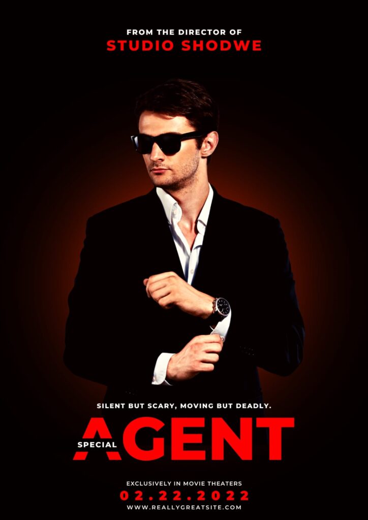
Table of Contents
- Introduction
- The Evolution of Movie Posters
- Elements of Effective Movie Posters
- Case Studies in Movie Poster Design
- The Impact of Movie Posters on Audience Perception
- Notable Trends in Modern Movie Poster Design
- Conclusion
- FAQs
The Evolution of Movie Posters
Early Beginnings
The tradition of movie posters dates back to the late 19th and early 20th centuries. The earliest posters were simple, text-heavy designs that relied on hand-drawn illustrations. They primarily featured the title of the film, the cast, and the director, often in ornate typefaces. As films transitioned from silent to sound, the demand for more engaging visuals increased. Read More
The first known film poster is believed to be for the 1895 short film “La Sortie de l’Usine Lumière à Lyon” (The Arrival of a Train at La Ciotat Station). This early poster showcased a straightforward visual representation of the film, with minimal text. Over time, however, filmmakers and marketers recognized that a well-designed poster could significantly impact a film’s success.
For a deeper dive into the history of movie posters, you can refer to This History of Movie Posters by Film School Rejects.
The Golden Age of Hollywood
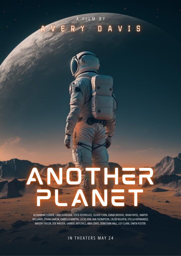
The Golden Age of Hollywood (1927-1960) saw a shift toward more artistic and stylized designs. Posters from this era often featured painted artwork, a trend popularized by artists like Saul Bass and Drew Struzan. These artists understood that a compelling visual could convey the film’s emotional tone better than text alone.
During this time, poster designs began to incorporate photography alongside painted artwork, creating a new dynamic. The use of bold colors and striking imagery became the norm, influencing how filmmakers and marketers approached film promotion. This period marked the beginning of what we recognize today as the standard movie poster format. For More Info
The Modern Era
In recent years, the digital revolution has transformed how movie posters are created and disseminated. Graphic design software such as Adobe Photoshop and Illustrator allows designers to experiment with complex graphics and typography. This shift has led to the rise of minimalist designs, often focusing on a single powerful image rather than cluttered compositions.
The advent of social media has also altered the landscape of movie marketing. Platforms like Instagram and Twitter have given rise to the “shareable” poster—designs intended to go viral. This has led to a renewed focus on originality and creativity in poster design. Graphic Design
For an exploration of contemporary trends in movie poster design, check out The Evolution of Movie Poster Design on Creative Bloq.
Elements of Effective Movie Posters
Typography
Typography is a critical component of movie posters. The choice of typeface can evoke different emotions and attract specific audiences. For instance, horror films often utilize jagged, distorted fonts to create a sense of unease, while romantic comedies may use soft, rounded typefaces to evoke warmth and approachability.
The hierarchy of text is also important; the film title should be the most prominent element, followed by the tagline, cast names, and other credits. The alignment and spacing must be carefully considered to create balance and readability.
Color Theory
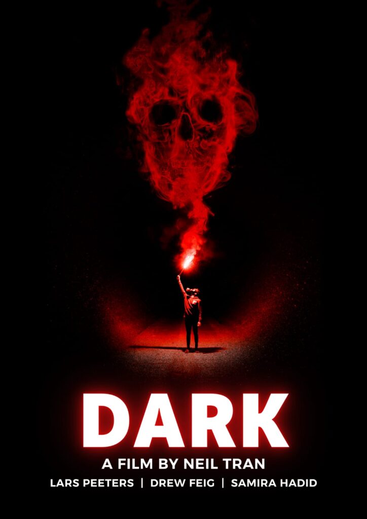
Colors have psychological implications, and their use in movie posters is meticulously planned. Red can signal passion or danger, while blue often conveys tranquility or sadness. Understanding color theory is vital for designers to communicate the film’s mood effectively.
For instance, the use of dark tones in a horror film poster might invoke feelings of fear and suspense, while bright, vibrant colors in a children’s film poster convey joy and excitement. The strategic use of color can significantly enhance a viewer’s emotional response to the film.
For a deeper understanding of color theory, refer to Color Theory in Graphic Design on Smashing Magazine.
Imagery
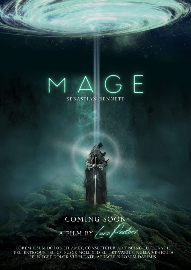
Imagery is arguably the most crucial element of movie posters. A powerful image can capture the audience’s attention instantly. Designers often use high-quality photographs or original illustrations to convey the film’s theme. The integration of characters, settings, and iconic symbols enhances storytelling through visuals.
For example, the image of the shark in “Jaws” is not just an image; it’s a representation of the film’s central conflict. Similarly, the close-up of a character’s face can convey emotional depth, inviting viewers to connect with the story on a personal level.
Layout
The layout of a movie poster must balance visuals, text, and white space. An effective layout guides the viewer’s eye through the poster, emphasizing essential elements. Designers often utilize grids and asymmetry to create visually dynamic compositions that engage the viewer.
The placement of elements is crucial. The title should draw the eye first, followed by the imagery and supporting text. The use of white space can enhance readability and make the poster feel less cluttered, allowing key elements to stand out.
Case Studies in Movie Poster Design
“Jaws” (1975)
The poster for Steven Spielberg’s “Jaws” is iconic for its simplicity and effectiveness. Featuring a menacing shark rising from the depths, the poster immediately communicates danger and tension. The use of bold typography and minimal color contrasts makes the poster unforgettable. It’s a prime example of how imagery and typography can work harmoniously to create a lasting impression.
The tagline “You’ll never go in the water again” complements the image, enhancing the sense of fear and intrigue. This synergy between visual and textual elements exemplifies successful movie poster design.
“The Silence of the Lambs” (1991)
This poster is another classic that employs the use of negative space effectively. The image of the moth covering Jodie Foster’s mouth is both haunting and thought-provoking, perfectly encapsulating the film’s themes of silence and fear. The design’s stark color palette enhances its emotional impact, making it a memorable piece in movie poster history.
The minimalistic approach allows the viewer to focus on the most critical elements, evoking curiosity and apprehension. This poster demonstrates how less can be more in design, leading to a powerful and enduring image.
“Her” (2013)
Spike Jonze’s “Her” employs a minimalist approach, using a simple yet striking color scheme and a close-up of Joaquin Phoenix’s character. The poster emphasizes the film’s themes of loneliness and technology, engaging viewers’ curiosity. Its simplicity stands in stark contrast to more traditional posters, showcasing the evolution of design trends in the film industry.
The choice of colors—soft pastels—paired with the minimalist layout effectively communicates the film’s emotional tone. It invites viewers to reflect on the themes of connection and disconnection prevalent throughout the story.
“Mad Max: Fury Road” (2015)
The poster for “Mad Max: Fury Road” is a vivid example of how dynamic imagery can convey chaos and energy. Featuring intense action scenes and striking character portraits, the poster embodies the film’s high-octane aesthetic. The color palette is bold, with reds and yellows dominating, invoking feelings of excitement and urgency.
The use of typography is equally engaging; the film’s title is displayed prominently, integrated seamlessly with the chaotic imagery. This poster is a testament to how well-executed design can evoke the spirit of a film, drawing in audiences.
The Impact of Movie Posters on Audience Perception
Psychological Triggers
Movie posters play a significant role in shaping audience expectations. A well-designed poster can entice potential viewers, while a poorly executed one can deter them. Research in psychology indicates that visuals significantly impact decision-making, making the design of movie posters a critical aspect of film marketing.
Different design elements evoke various emotional responses. For example, horror films often utilize dark color palettes and unsettling imagery to induce fear, while comedies may use bright colors and playful fonts to elicit joy. Understanding these psychological triggers allows designers to craft posters that resonate with specific audiences.
Cultural Influences
Cultural context also affects how movie posters are perceived. For instance, a poster designed for an American audience may not translate effectively in other cultures. Designers must be aware of cultural symbols, color meanings, and design preferences to create posters that resonate globally.
A film’s target demographic can also dictate the style of the poster. For example, a children’s animated film will have a vastly different aesthetic compared to a gritty drama aimed at adults. Recognizing these nuances ensures that the poster appeals to the intended audience.
To explore how cultural factors influence design, check out Cultural Differences in Design on Smashing Magazine.
The Role of Technology
With the rise of digital media, the way movie posters are created and distributed has transformed significantly. Designers now have access to advanced tools that allow for more intricate designs and quicker iterations. The internet has also expanded the reach of posters, enabling them to go viral on social media platforms.
Digital technology allows for interactive posters and promotional material that can engage audiences in new ways. For instance, some films have utilized augmented reality (AR) to create immersive experiences where viewers can interact with the poster through their smartphones.
Social Media Impact
Social media platforms have revolutionized film marketing strategies. Movie posters are now crafted with the intent to be shared online. A poster that garners attention on platforms like Instagram or Twitter can greatly influence a film’s visibility and success.
Designers must consider how their work
will look in digital formats, which often requires adapting traditional design principles for online audiences. The potential for virality means that designers need to be both creative and strategic, ensuring that their posters not only catch the eye but also invite sharing.
Notable Trends in Modern Movie Poster Design
Minimalism
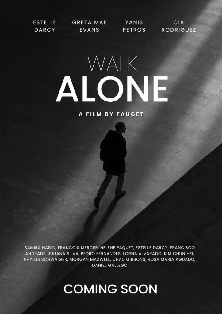
The minimalist trend in graphic design has significantly impacted movie poster design. Many modern posters adopt a simplified aesthetic that often features a single, striking image with minimal text. This approach emphasizes clarity and allows for more impactful visual storytelling.
Posters like those for “The Social Network” and “Ex Machina” exemplify this trend. They focus on a central image that encapsulates the film’s theme, effectively communicating its essence without overwhelming the viewer with information.
Retro and Vintage Styles
Nostalgia plays a significant role in contemporary design. Many filmmakers and designers draw inspiration from retro and vintage styles, utilizing elements from past decades to create posters that evoke a sense of familiarity. This trend can be seen in films like “Stranger Things” and “La La Land,” which both incorporate vintage aesthetics in their promotional materials.
These designs often use muted color palettes, retro typography, and vintage illustrations, appealing to audiences’ sentimental feelings and adding a layer of charm to the films.
Photorealism
The advancement of digital art tools has made photorealism increasingly popular in movie poster design. High-quality images combined with graphic elements can create stunning visuals that draw viewers in. This trend is particularly prevalent in action and science fiction films, where visuals can be grand and spectacular.
Posters for films like “Avatar” and “Guardians of the Galaxy” leverage photorealistic graphics to present visually captivating designs that highlight the expansive worlds within the films.
Typography as Art
Typography has become a focal point in many modern movie posters, with designers using type as a central visual element rather than just a means of communication. Bold, creative typography can capture attention and convey the film’s tone effectively.
The poster for “Birdman,” for instance, utilizes typography in a way that reflects the film’s themes of identity and perception. The playful arrangement of letters and the choice of typeface contribute significantly to the overall impact of the design.
The Future of Movie Posters
As we look to the future, the digital age promises even more innovation in movie poster design. With the rise of virtual and augmented reality, the possibilities for creative expression are limitless. Designers may explore interactive posters that allow viewers to engage with the content more deeply, creating a more immersive experience.
The Role of AI in Design
Artificial intelligence is beginning to play a role in graphic design, including movie posters. AI tools can analyze trends and generate design ideas, providing designers with a wealth of inspiration. However, the human touch remains essential; the emotional resonance of a well-crafted poster requires a nuanced understanding of storytelling that AI cannot replicate.
Sustainability in Design
As environmental concerns grow, the film industry is becoming increasingly aware of its ecological footprint. This awareness extends to poster design, with an emphasis on sustainable materials and practices. Designers may begin to use eco-friendly printing methods and materials, reflecting a commitment to sustainability in the film marketing sector.
Personalized Marketing
With advancements in data analytics, film marketers are beginning to create personalized content based on audience preferences. This could lead to variations in movie posters tailored to different demographics, making marketing efforts more effective and engaging.

Conclusion
The art of movie posters is a fascinating intersection of graphic design, marketing, and psychology. As films continue to evolve, so too will the designs that promote them. Understanding the elements that make effective movie posters—from typography and color theory to imagery and layout—is essential for both designers and filmmakers.
As we delve deeper into the future, the digital age promises further innovations in movie poster design. With the rise of interactive technologies and a growing focus on sustainability, designers will have even more opportunities to express their creativity.
Whether through traditional techniques or cutting-edge technology, the allure of movie posters will undoubtedly continue to captivate audiences for generations to come. The journey of movie posters, from their humble beginnings to their current status as integral elements of film marketing, reflects the broader evolution of visual communication in our society.
For more insights into the world of movie posters, consider checking out Posteritati, a website dedicated to movie poster art, featuring an extensive collection of vintage and contemporary designs. Also Visit
FAQs
Q1: What is the purpose of a movie poster?
Movie posters serve to promote a film, providing potential audiences with a visual representation of its themes, tone, and genre. They aim to attract viewers and generate interest before the film’s release.
Q2: How have movie posters evolved over time?
Movie posters have evolved from simple, text-heavy designs in the early 20th century to more artistic and visually complex pieces today. The use of photography, digital tools, and minimalist designs has transformed how posters convey a film’s essence.
Q3: What are the key elements of an effective movie poster?
Key elements include striking imagery, compelling typography, strategic use of color, and a balanced layout. These elements work together to create a visual narrative that resonates with the target audience.
Q4: Who are some famous movie poster designers?
Notable designers include Saul Bass, known for his iconic graphic designs; Drew Struzan, famous for his painted posters; and Olly Moss, recognized for his minimalist and artistic approach.
Q5: How do color and typography impact a poster’s design?
Color sets the mood and evokes emotions, while typography conveys information and can enhance the film’s genre or tone. Together, they create a cohesive design that captures audience attention.

I don’t think the title of your article matches the content lol. Just kidding, mainly because I had some doubts after reading the article.
I don’t think the title of your article matches the content lol. Just kidding, mainly because I had some doubts after reading the article.